
Report Section Layout
Introducing the Dedicated Reports Section
Managing reports and analytics just got simpler with the new dedicated Reports section in your dashboard. This improvement keeps heavy, data-dense tables organized and easily accessible while reducing screen clutter on scheduling and revenue tabs.
Step 1: Navigate to the New Reports Section
You’ll now see three main tabs: Scheduling, Revenue, and the new Reports tab. Scheduling and Revenue keep their original layouts, while all detailed, data-heavy tables move to Reports.
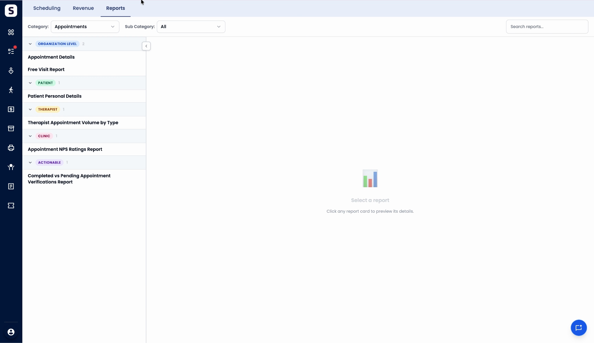
Step 2: Explore Organized Report Categories
In the Reports section, find reports neatly arranged by Category and Subcategory. Each report is listed individually for quick access.

Step 3: Select a Report to View Details
Click any listed report. It loads individually, giving you a focused workspace.

Step 4: Use Custom Filters for Each Report
Each report comes with its own set of custom filters, designed specifically for the data you see—no more using a one-size-fits-all filter set.

Step 5: Read the Report Description
Every report includes a brief, clear description so you immediately understand its purpose and contents.

Step 6: Maximize the Data Area
For a deeper dive, minimize side panels to expand your view and analyze reports more comfortably.

Step 7: Enjoy Streamlined Performance
Keeping detailed reports separate means scheduling and revenue tabs load faster, since they’re not bogged down by heavy data tables.
Switching to a dedicated Reports section streamlines complex analytics, keeps dashboards tidy, and helps you find and filter important data faster. Dive in to experience faster loading times and a more organized workspace.